Apex Entertainment
Recasting a massive entertainment destination — and its traffic-driving web site — for off-the-charts fun.
B2C brand platform, tone, site copywriting
Collaborators: Sleek Machine/Boston — Jenn Cunningham, designer; Sean Cunningham, Creative Director; Alex Viteri, Strategy
Photo credits: Apex Entertainment/Joshua Lyons Architectural Photography
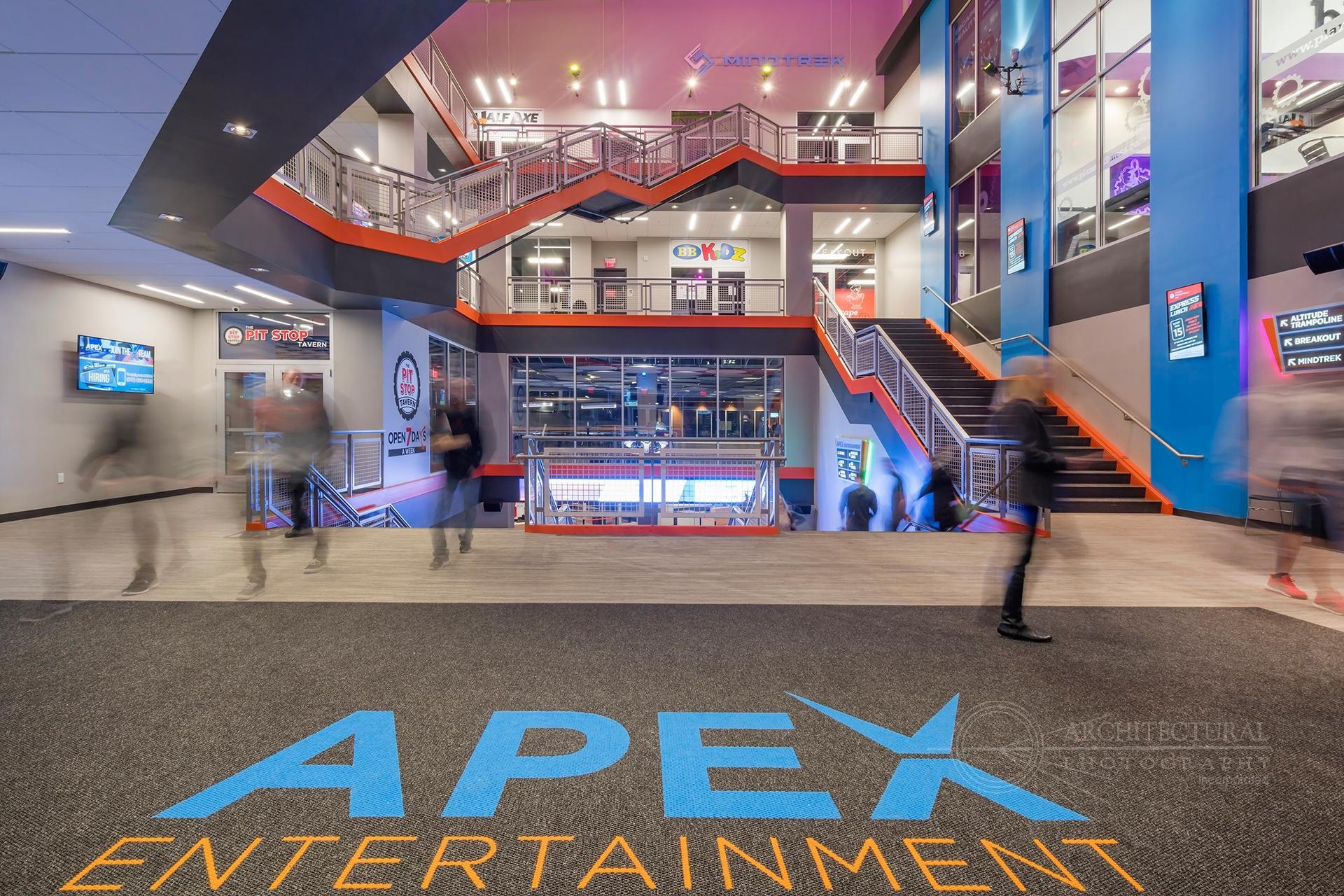
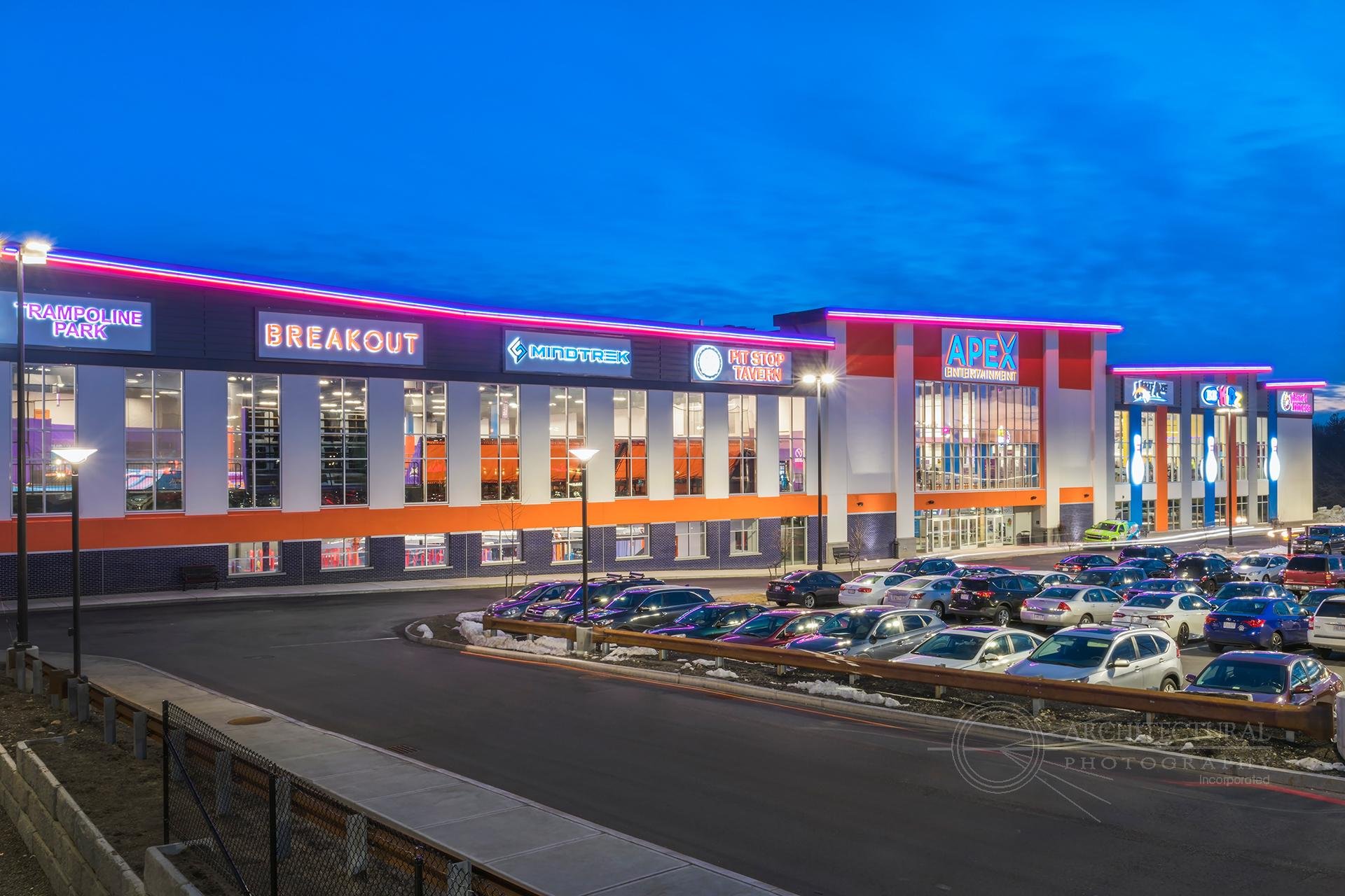
Apex is an upstart leader in massively entertaining complexes — think 100,000 square feet, multiple floors — full of games, activities, food, bowling, go-karts. It’s off the charts fun for people with families, but also for work events, parties, etc.
While the concept is hugely successful, their brand and home site undersold the jaw-dropping, sheer amazingness of the experience. Apex has four locations, all similar in massive scope and scale.
But for years, Apex appeared quite functional and indistinct:
Step One:
“Ways In” Brand Voice Exploration
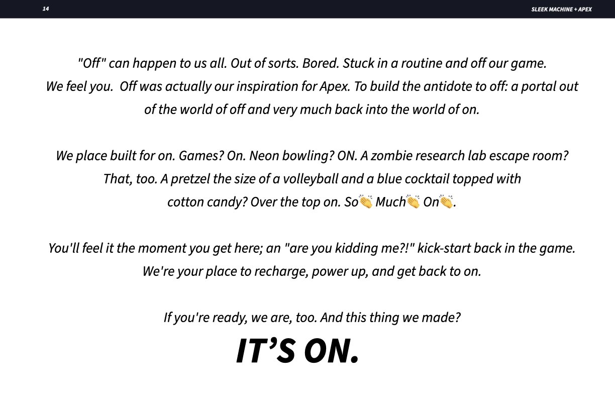
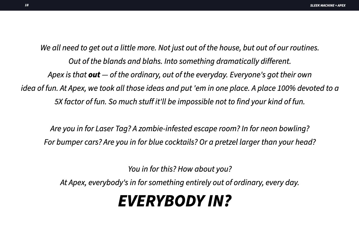
First up was trying to resolve how to speak as and about Apex. Working from strategic foundations developed by Sleek Machine’s Alex Viteri, I wrote a range of four “ways in.”
No comps. Just voice and attitude to set the foundations. The core idea: more fun, more vibe, more… amazing, up to the Apex experience standard. This was round one:
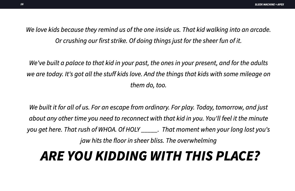
The winning concept.
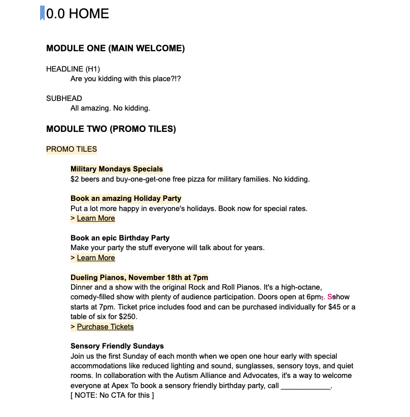
Apex chose well. “Are you kidding with this place?!?” captured the overwhelmed feeling visitors get walking into and through an Apex location.
Our lead designer Jenn Cunningham put the headline to work, giant and active to match the vibe, smack in the center of the new site experience.
The grunt work.
171 pages of copywriting and detail.
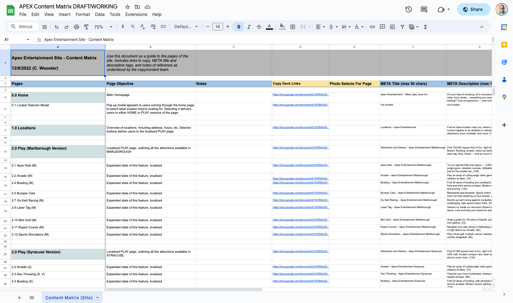
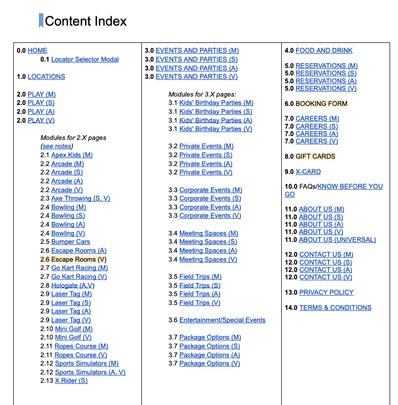
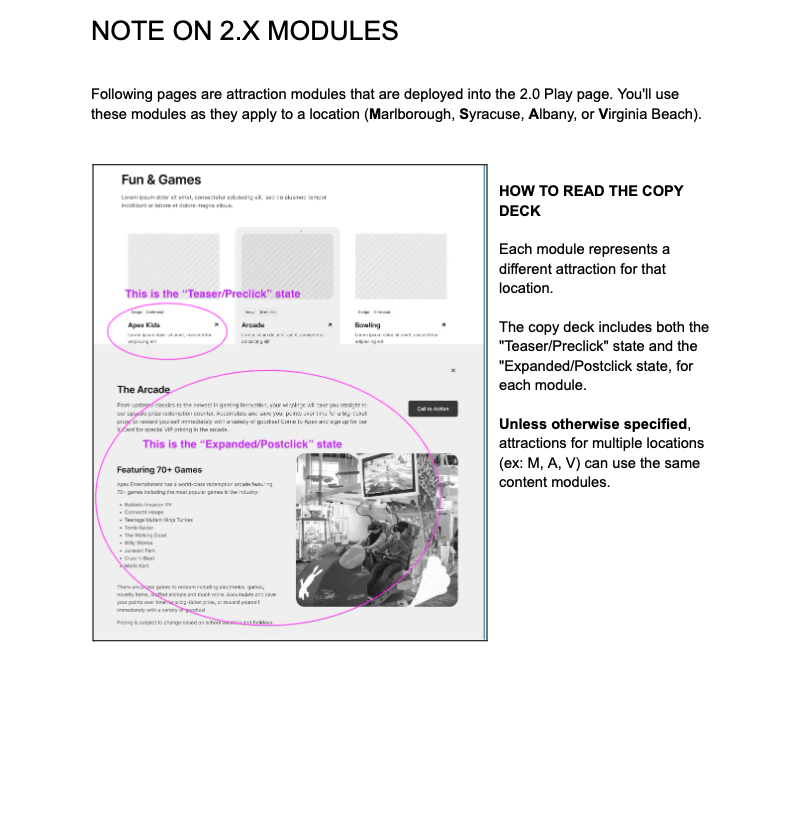
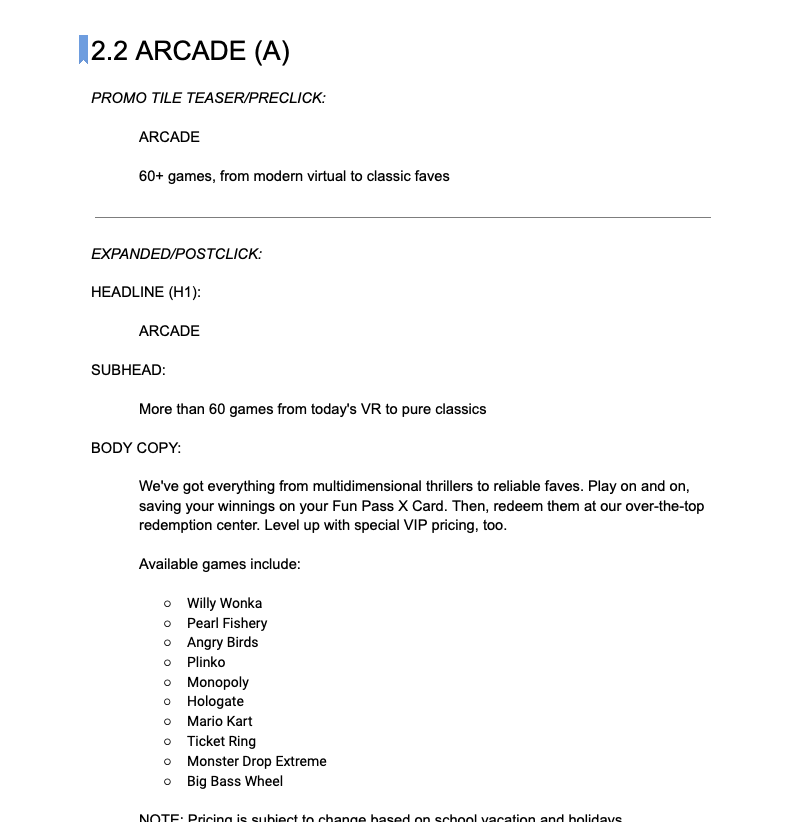
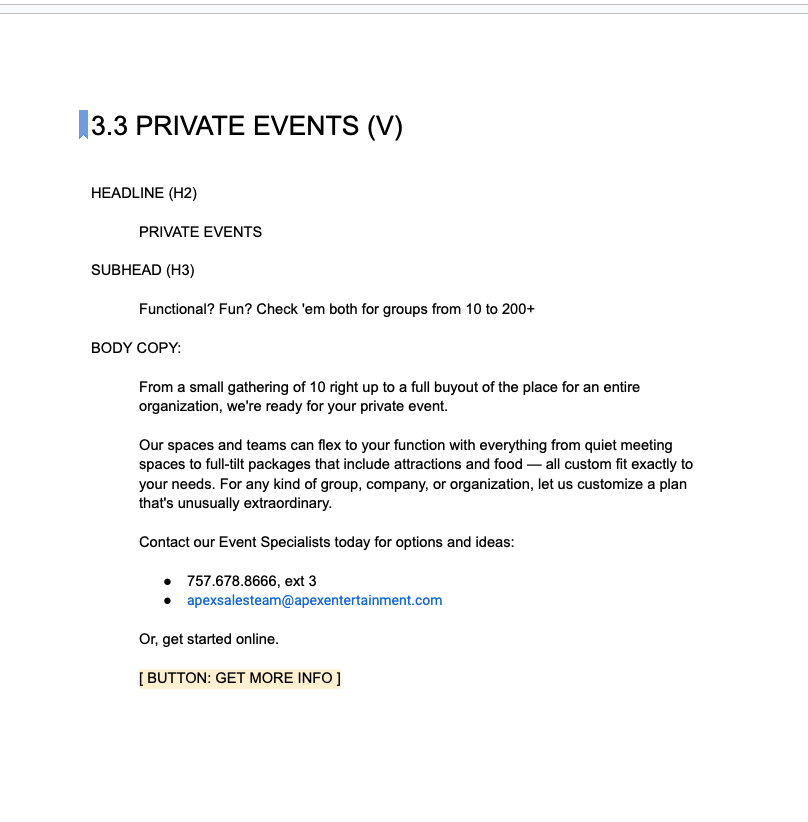
Any writer can bring sexy headlines. I extended that work into every corner of the 40 page site, creating a content matrix of all page content for dev reference, and a huge multi-variant copy deck for all the flavors of Apex’s offering.
The site deck topped out at 171 pages, encompassing all the intricate detail behind every experience at every one of Apex’s four locations — what’s there? locations? details on party offerings, etc.
It also served as an central point of editing (in Google Docs) to eliminate version control problems, client feedback tracking, and sharing among an array of stakeholders.


