
Atlassian University
Recrafting 100+ pages of content and design for better usability, conversion, and context
B2B + B2C: creative lead, content strategy, copywriting/copy editing, design research (heuristic competitive evaluation) presentation and client management, project management
Collaborators: Lauren Appa (content strategy), Blake Quackenbush (design), Liberty Carlin (design research)
Jira and Confluence are staples of enterprise collaboration. Agile teams use them every day to move teams through product and project management. Users turn to Atlassian’s training tools to gain confidence and skill, invidually or as a team.
When Atlassian replatformed its courses to a new LMS (learning management system), they took a fresh look at promotional content across the site. I led a team revisiting 100+ pages of content, restructuring it for persuasiveness, clarity, context, and consistency.
I personally visited every one of those pages, reworking each to meet a new standard of quality.
The problem:
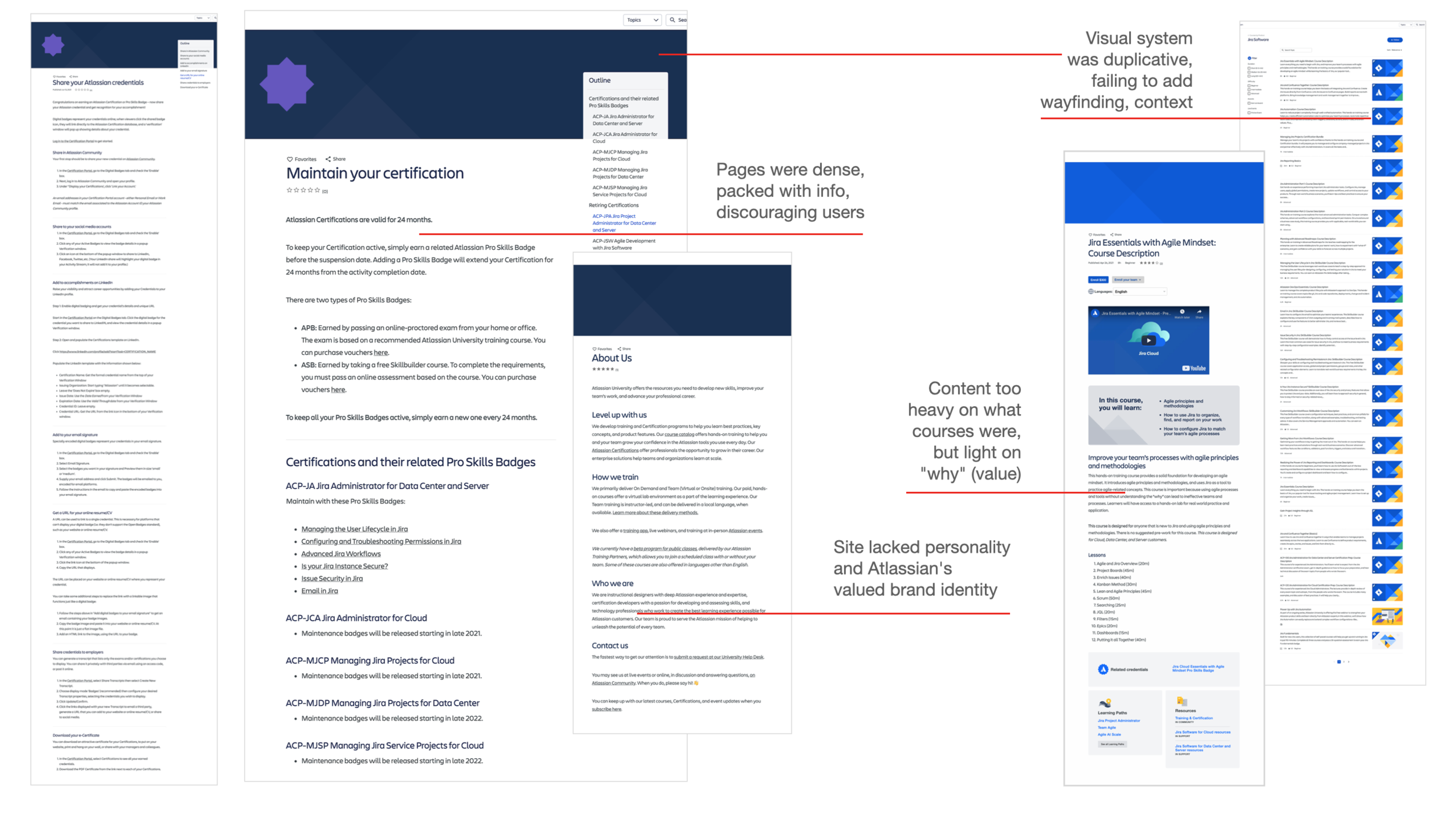
In initial user testing, pages were too dense, too hard to scan, and intimidating.
We started off taking stock of the content with prospective users. They reported that the idea and the content itself was appealing, but the structure of it was difficult to get through.
When pressed, they were interested, but often failed to engage with the content. This was a user experience problem and a business problem, as Atlassian was losing opportunity to convert browsers into paying course-takers.
The process:
Working collaboratively with Atlassian, we revised and retested pages to verify improvements. Good news: it worked.
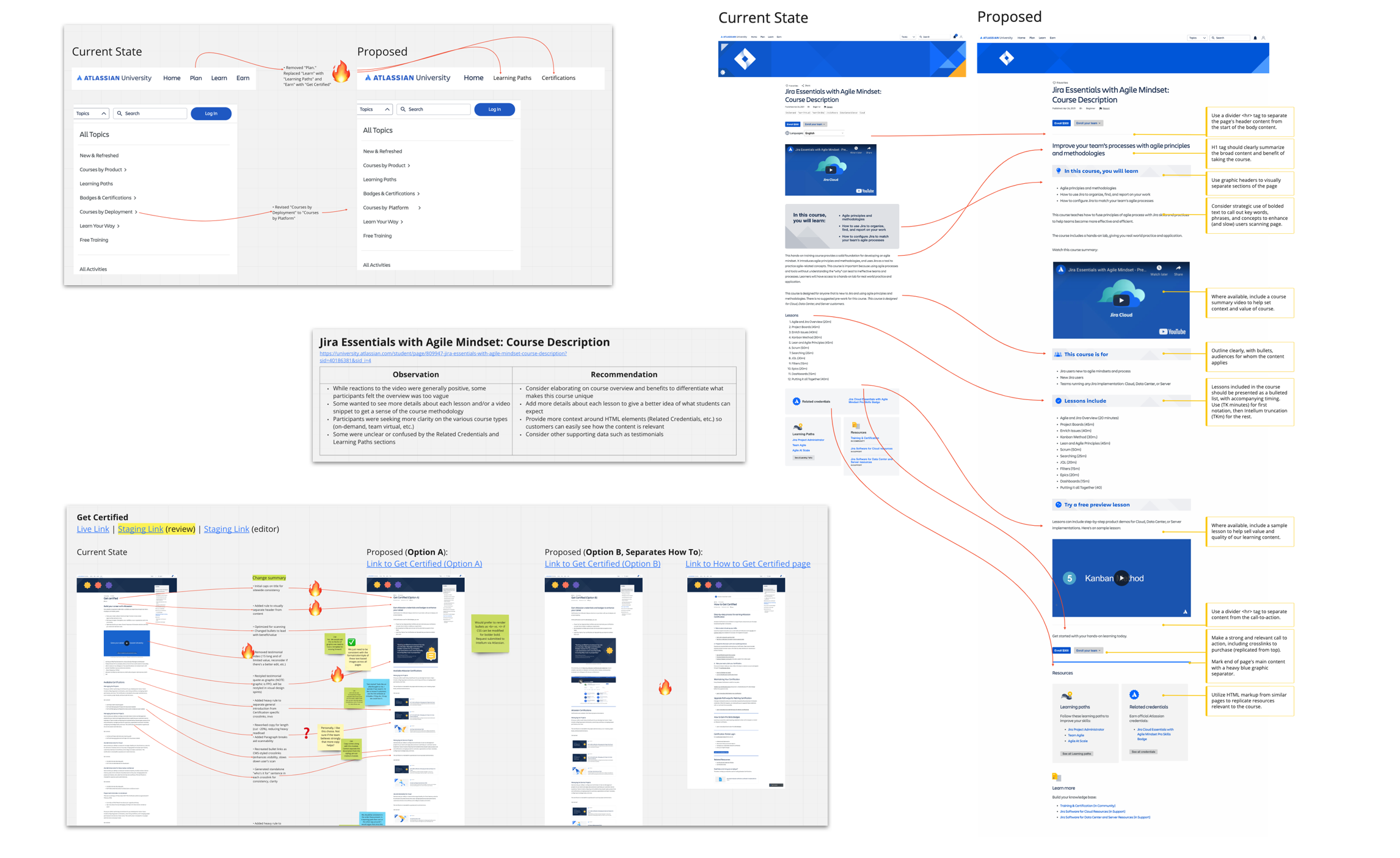
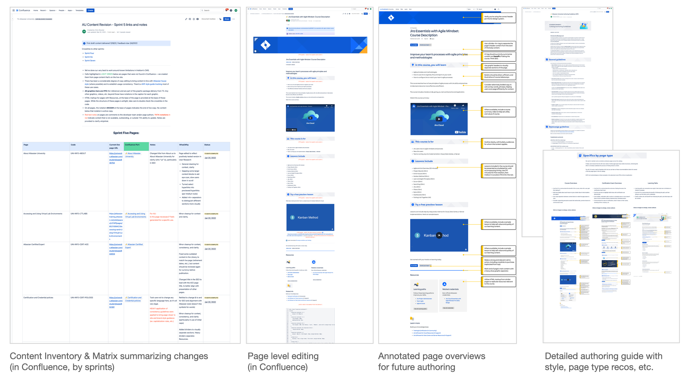
Before revisiting 100+ pages of content on pure instinct, we took 10 predominant page types and reworked them to address user needs. Working in Miro with Atlassian’s teams, we built several prototypes and retested the pages for before vs. after metrics. We evaluated everything: page structures, dividers, H1 tags, even the site’s taxonomy — all to shape an authoring approach.
Most everything we did worked to improve the user experience in a second round of user testing. Engagement, comprehension, consideration, and overall interest peaked. This gave us a roadmap for content and visual design across nearly every page of the site.
The results:
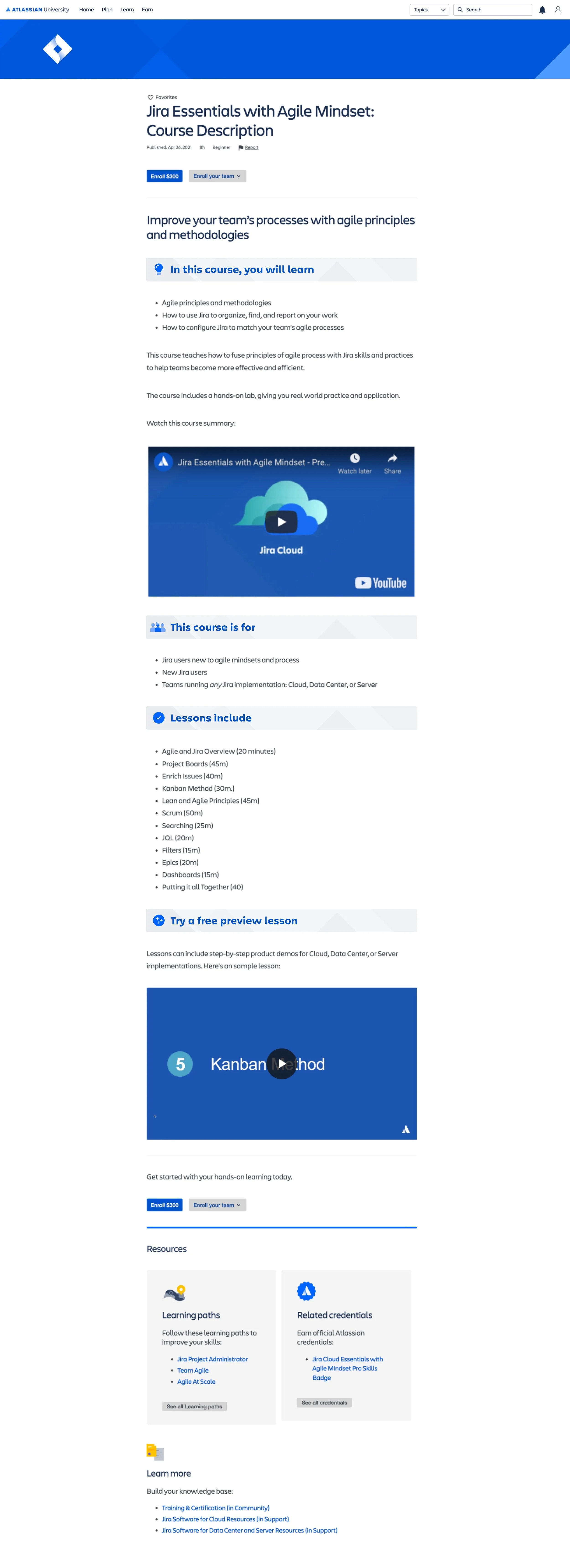
Selection of existing content (tap to enlarge)
Two rounds of user testing (pre- vs. post)
110+ pages rearchitected, edited for easier comprehension
Graphic design system overhauled for better context, wayfinding
Content authoring guide generated to inform future content creation
The improvement was both visible and practical: a more attractive and easily navigable site. Designer Blake Quackenbush overhauled the design system to provide better wayfinding, context, and vibrancy to the offering.
My content enhancements provided users improved sense of the value of it, and made it easier for users to scan pages, orient themselves quickly, and dig in to shorter, punchier, and ultimately better converting pages. Testing validated it.
Try it yourself at university.atlassian.com
Improved content/design (tap to enlarge)