Clover Connect (SaaS)
Distilling a complex payments system API into a compelling narrative for software developers.
Copywriting/brand building, Information Architecture / Wireframes, Branding, Landing Page design
Collaborators: Cesar Chin (design), Ellie Delany (copy)
Nobody thinks twice about the payments engines in apps you use; you pay your hairstylist or for a bagel — it just happens, right?
That payment exchange is software built into apps by their developers, and payments giant bought CardConnect, a company that provided it. They rebranded Card Connect inside FISERV’s Clover brand to become the new Clover Connect.
My team was brought in to rebrand the new Clover Connect, but also to compellingly distill what the API is and its value to Independent Software Vendors — essentially people who build apps for small retail operations (dentist office, shoe stores, etc.).
Building an app with payments? You need a Clover Connect.
The problem:
Complex offering. Nichey audience.
Clover Connect needed a better narrative.
New offering had to rebrand, relaunch fast.
In its previous incarnation, Card Connect suffered from a sameness in the eyes of ISV targets.
Copy made lots of bland and wordy promises without defining well exactly what the product actually was — a payments tool software developers could drop seamlessly into their existing industry-specific apps.
We had a short window of under a month to relaunch Card Connect as Clover connect; same benefits, but better communicated and rebranded under the Clover umbrella.
The Accelerated Solve:
Initial Brand Idea + Landing Page Wireframe
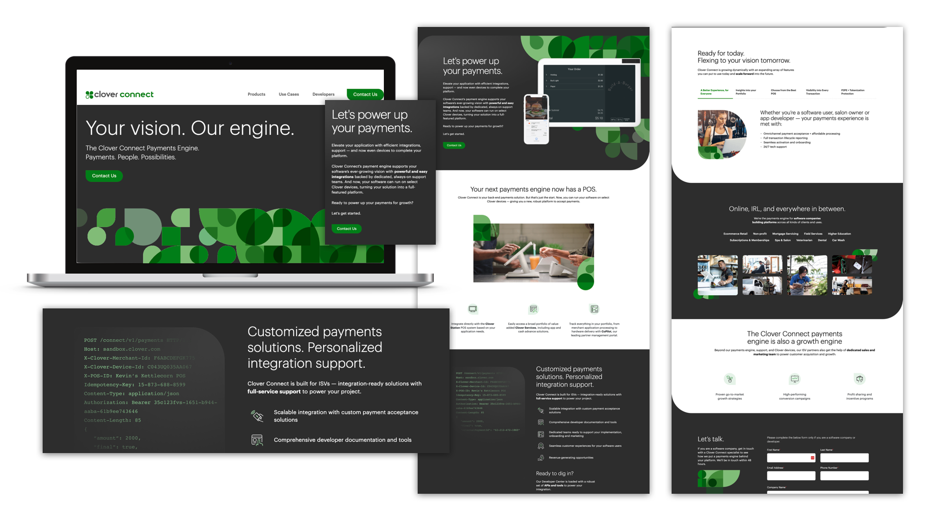
On a hyper accelerated timeframe, I wrote the grounding idea of “powering up payments” and “your vision, our engine” while also framing out the foundations of a landing page — the first brand expression:
I’m not simply a writer. I framed out the content strategy for the page, complete with objectives for each section.
Then I wrote a new platform and language into the wireframe I had designed.
The final expressions:
“Let’s power up your payments.” + “Your vision. Our engine.”
These phrases helped simplify the offering and clarify the benefit for software developers. Suddenly, Clover Connect had a distinct voice and position — one they still use today, years later in their branding.
We quickly distilled this into the site experience and brand, weaving it together as a close cousin to parent brand Clover.
Extending the voice:
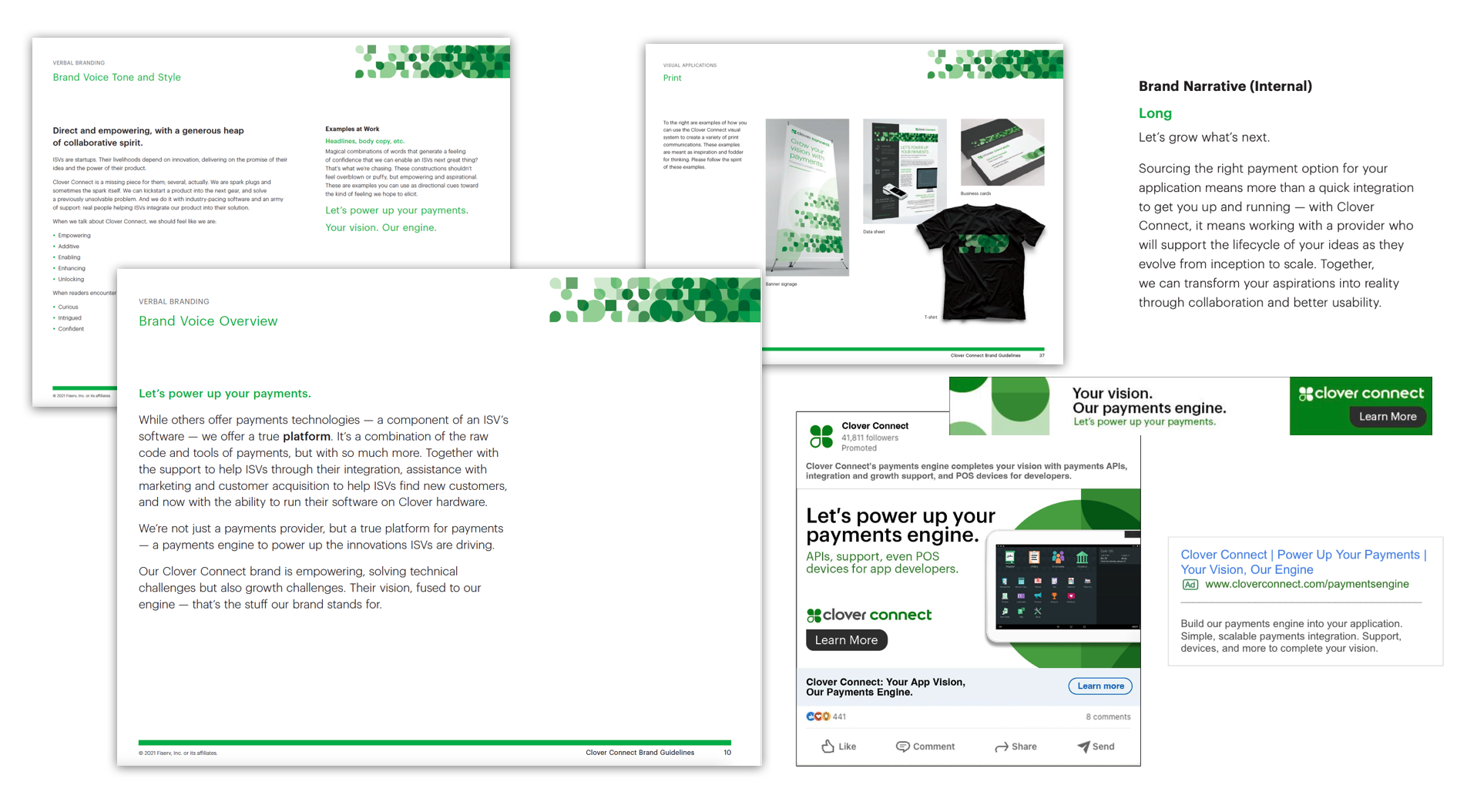
Brand Book, LinkedIn, banner expressions
We hit our launch date for the site, then quickly developed a working brand book and several immediate brand expressions for the market.


