Enterprise Vanpool Rebranding
Evolving a dated design system to meet modern consumers needs/wants
B2B + B2C: Pitch creative lead, lead presenter, creative direction, concept & copywriting
Collaborators: Nicole Chavez, Molly Guyton, Justin Clemens, Agata Seidel
ZipCar started it and Uber upped the game.
Our relationships with our vehicles has been changing for 15 years now.
That’s both opportunity and challenge for legacy rental brands like Enterprise. Among their many offerings was a clunky “vanpooling” offering where you band together with colleagues to share a vehicle to commute between home and work (remember when we did that?).
Cobbled together from several acquired smaller tier brands, Enterprise’s awkwardly named “V-Ride” (or RideShare, depending on what ad you were seeing) needed an overhauled identity, purpose, and value prop for modern commuters.
The problem:
Consumer needs were a distant afterthought in a confusing mishmash of branding, business-first marketing.
Through acquisitions, merged re-brands, and a confusing network of product offerings, Enterprise’s shared van-pooling offering was an unappealing mess.
If users were to even consider a vanpooling option — “co-commuting” in a term we coined — the product experience was buggy, requiring significant effort by the user to manage.
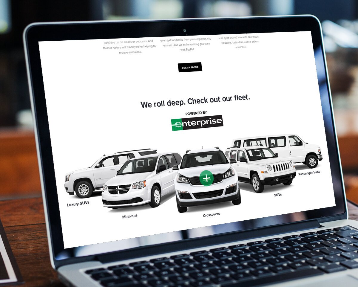
Plus, the vehicles. Would you want to ride to work in a rolling billboard like this vride offering? Enterprise needed a new, stickier offering to connect with a new generation of co-commuting targets.
The discovery/ideation:
We dove in to define who we were talking to, how they move through their days and process, and what they’d need from the brand.
The branding explorations:
A new concept for ride sharing — unbranded vehicles, better tools to build your vanpool — needed a new brand. Vride or even the bland “RideShare” said nothing to consumers. So we considered altogether new foundations, more suggestive of a modern experience.
Our two initial directions took inspiration from the brand strategies and the target consumers. People wanted to more connections in their lives. And to completely rethink their approach to getting to work.
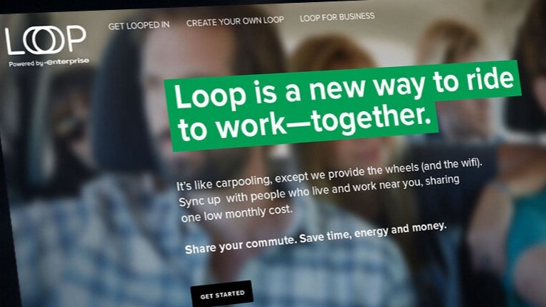
Each of these insights suggested conceptual directions that felt both modern and illustrative: Loop and Rive.
The experience:
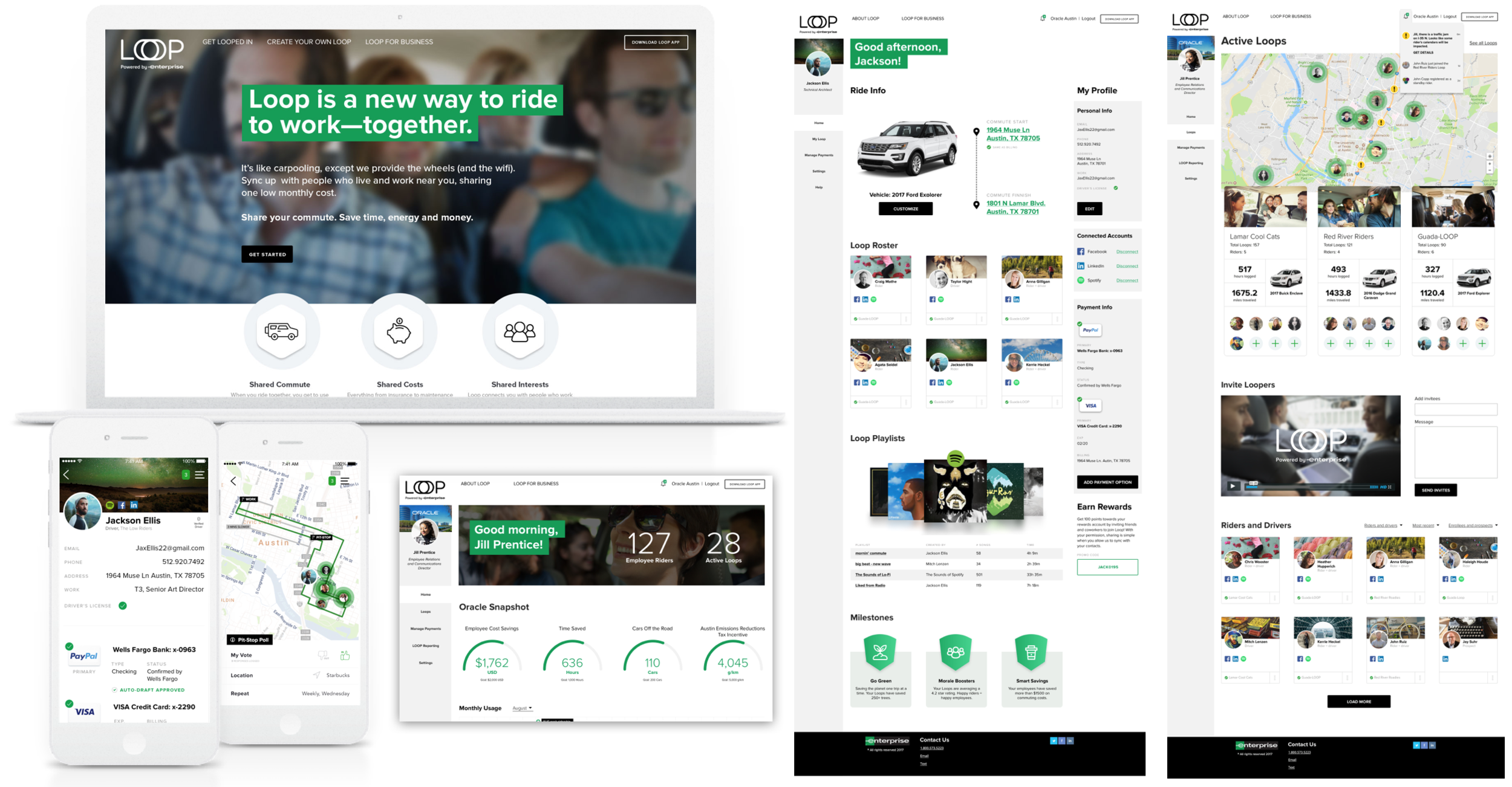
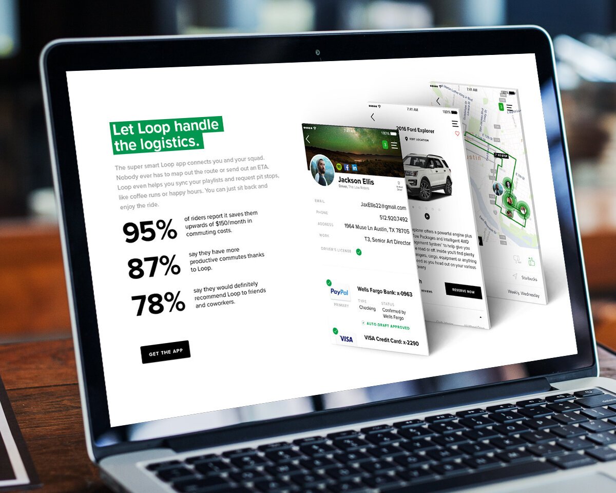
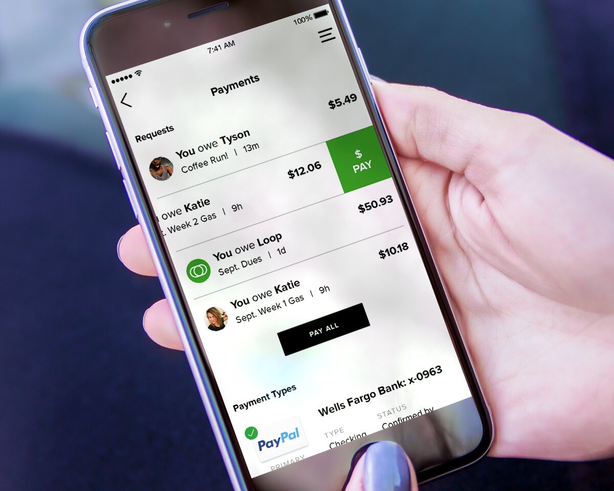
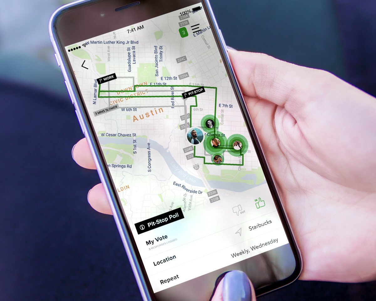
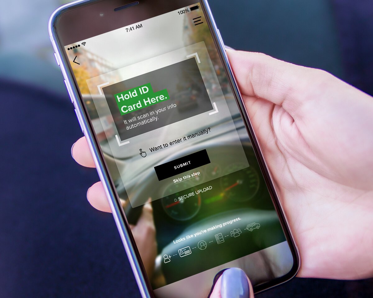
Our new vanpool experience depended on entirely new tools. From setting up a new vanpool to coordinating the group’s schedule, vehicle choices, payments, even the music to be played, we build a dashboard for the vanpool’s organizer and members to stay in the Loop. Mobile professionals need mobile-ready tools, so the experience was built for mobile viewports and functionality. Payments, social connections, communications — all of it was built into the tool. Along with handy tools to discover NEW “Loopers” unaffiliated users could join up with in a sort of vanpooling matchmaking.


