
Whole Foods 365 store rebranding /
design system reboot
Defining and designing message, utility, and application for Whole Foods concept stores
B2C/Branding: Creative direction, experience design research, brand strategy,
tagline development, UX & UI, copywriting, presentations
Creative collaborators: Laura Cook, Jamie Tran, Jon Copp, Annie Palgutt, Iva Zugic
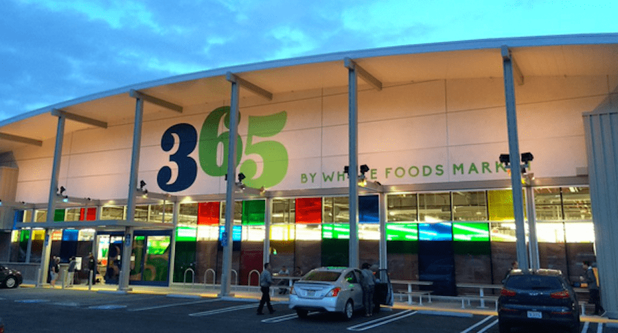
Stung by years of criticism for its “whole paycheck” prices, a pre-Amazon Whole Foods created a new store concept called 365 (confusingly similar to their house brand) focused on quality foods, fewer product SKUs, and fewer of the bells and whistles we’ve come to expect from a Whole Foods.

The first few stores launched with a new look, few cues to the parent brand, and a bit of confusion among consumers: “what is this place?” A quirky design system had to be quickly expanded to manage everything from ads to signage to the menu of smoothies available that day. Like many systems let loose in the wild, it quickly got sideways and haphazard.
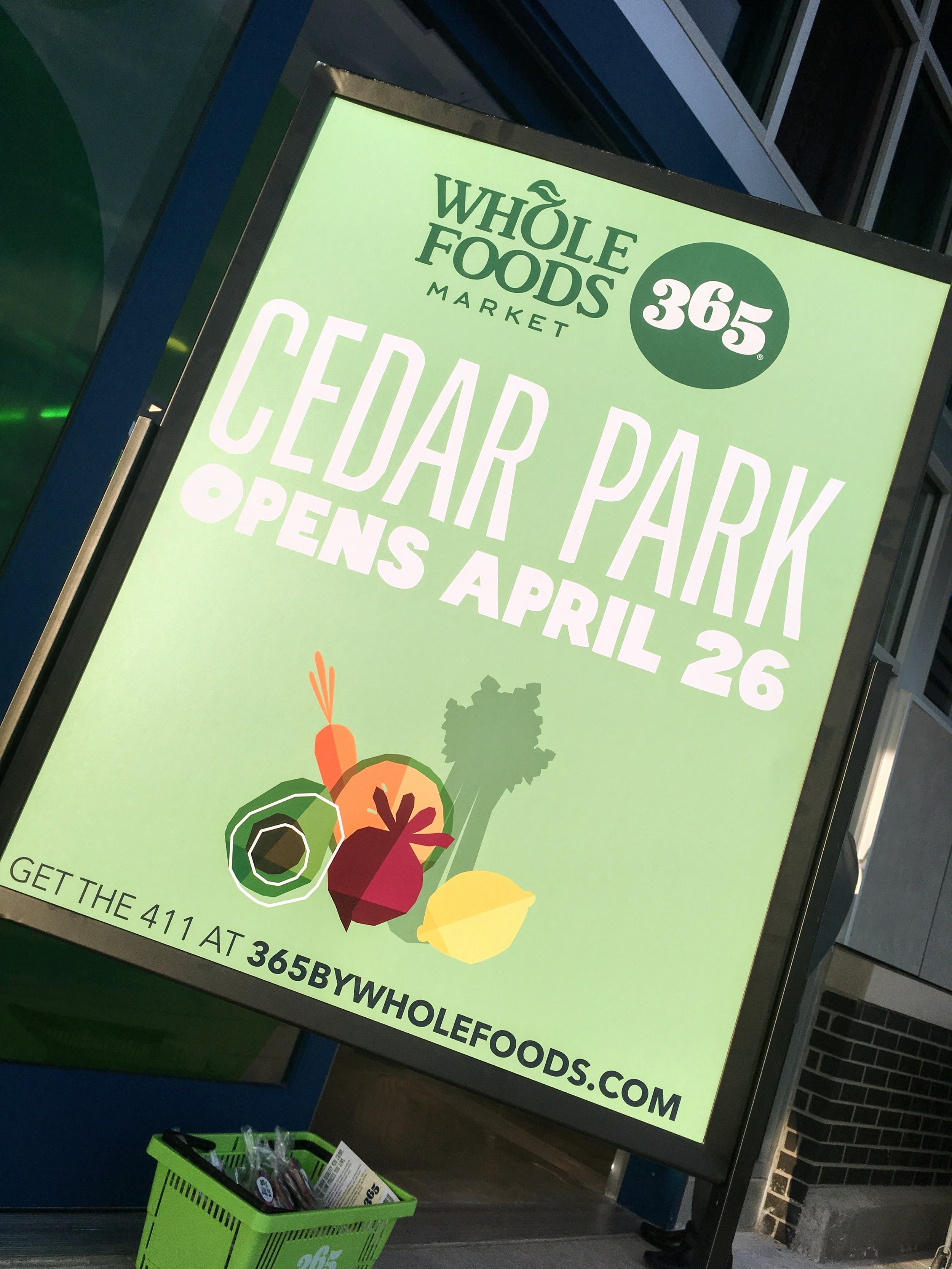
I was part of a team hired to reset, refocus, and help Whole Foods better resonate with the consumers who liked the concept and wanted it to thrive. Our test subject was an upcoming store launch planned for Cedar Park, just outside Austin.

The problem:
Shouty, inconsistent, unclear brand definition and utility.
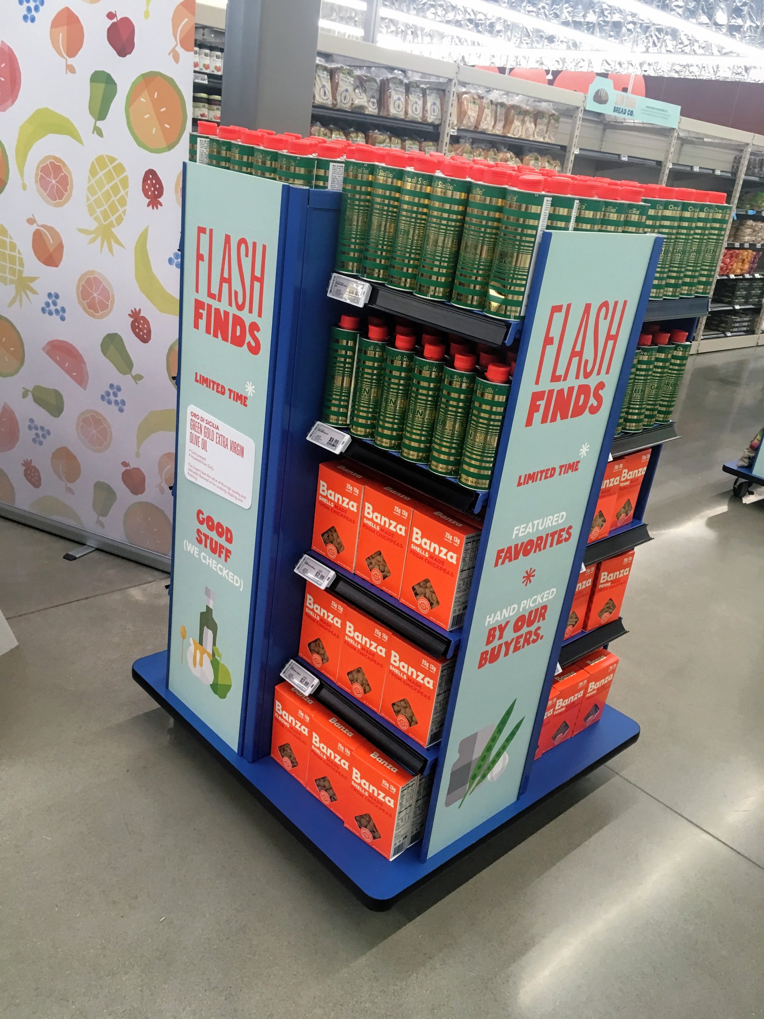
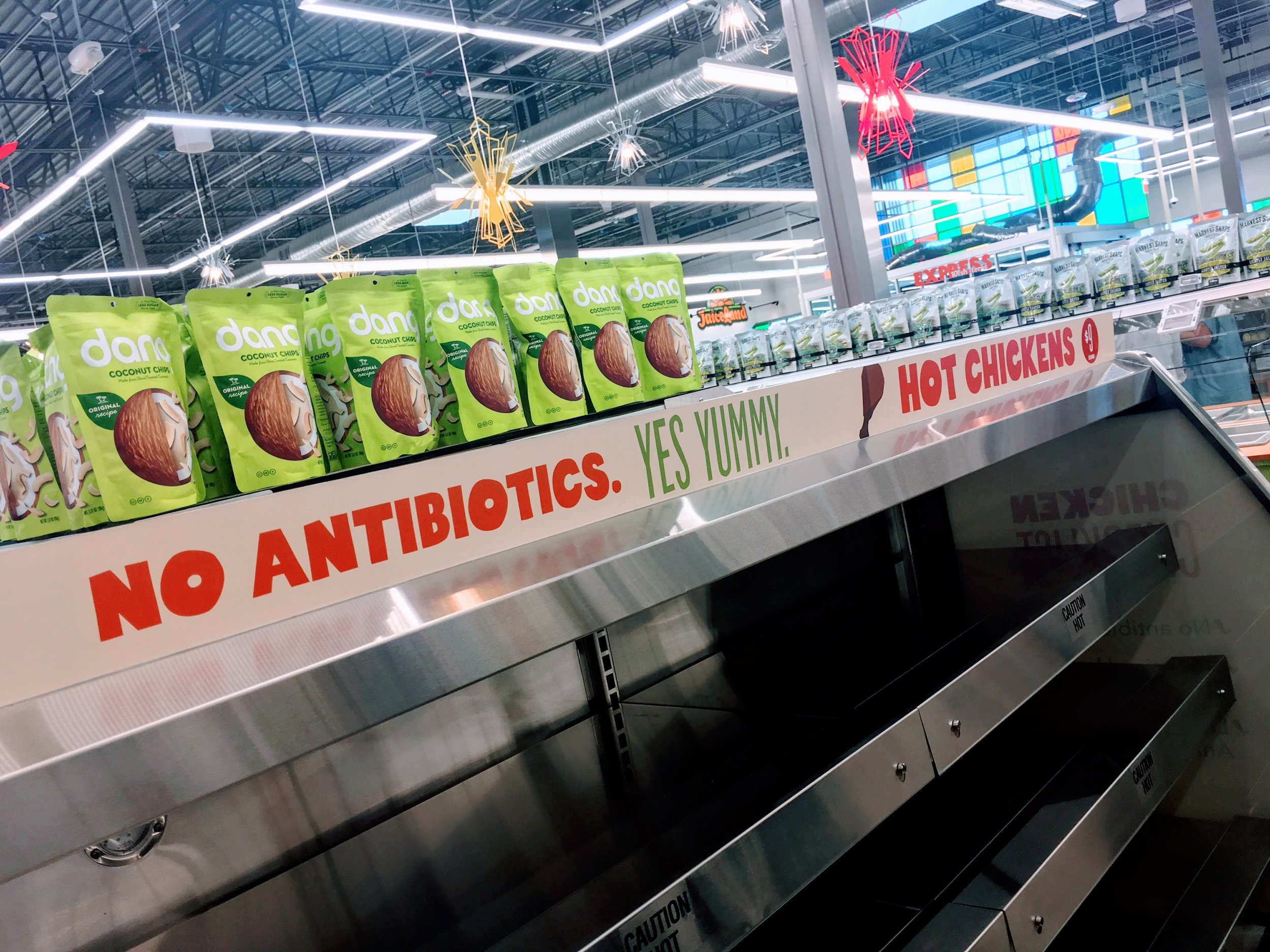
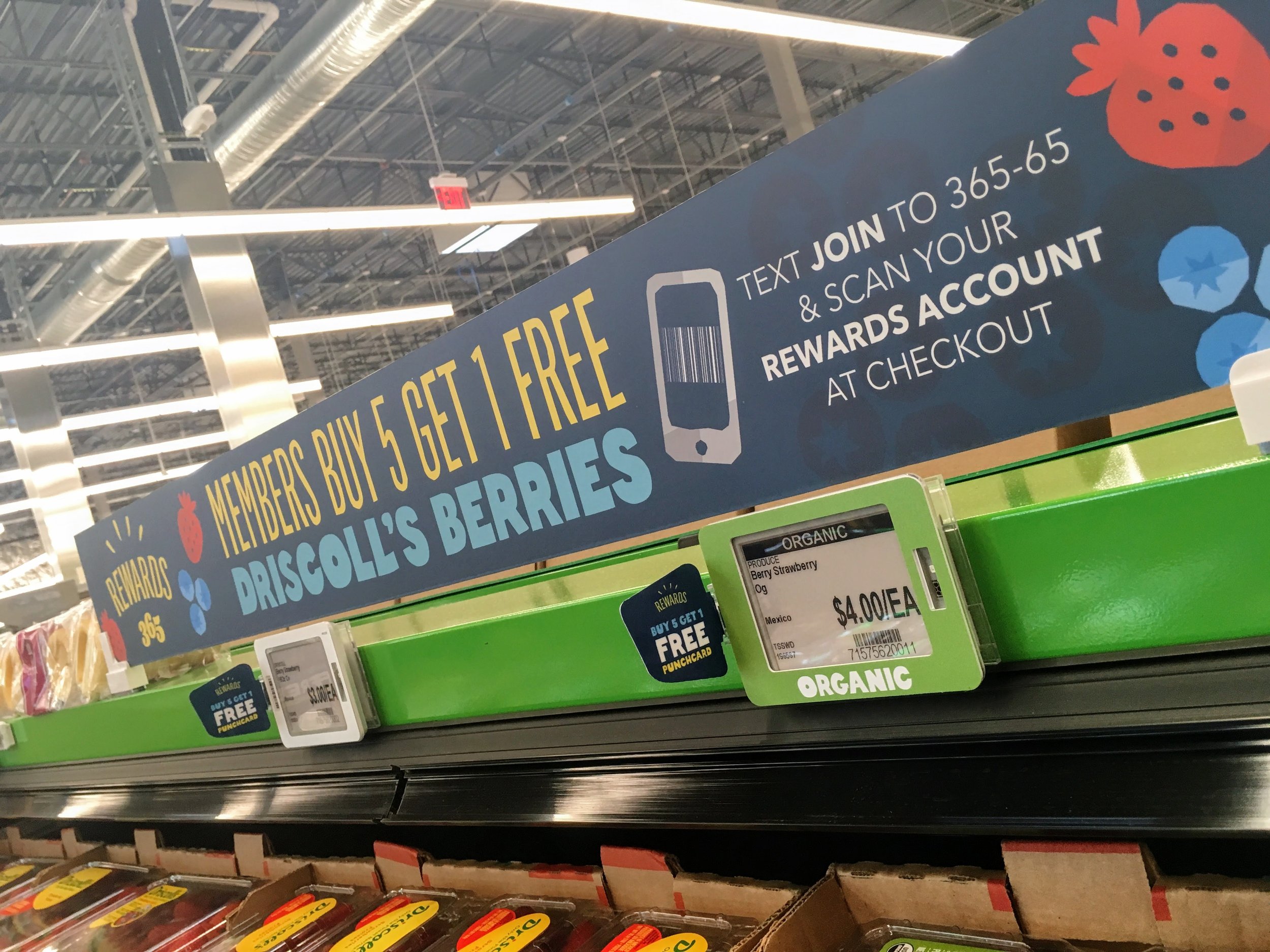
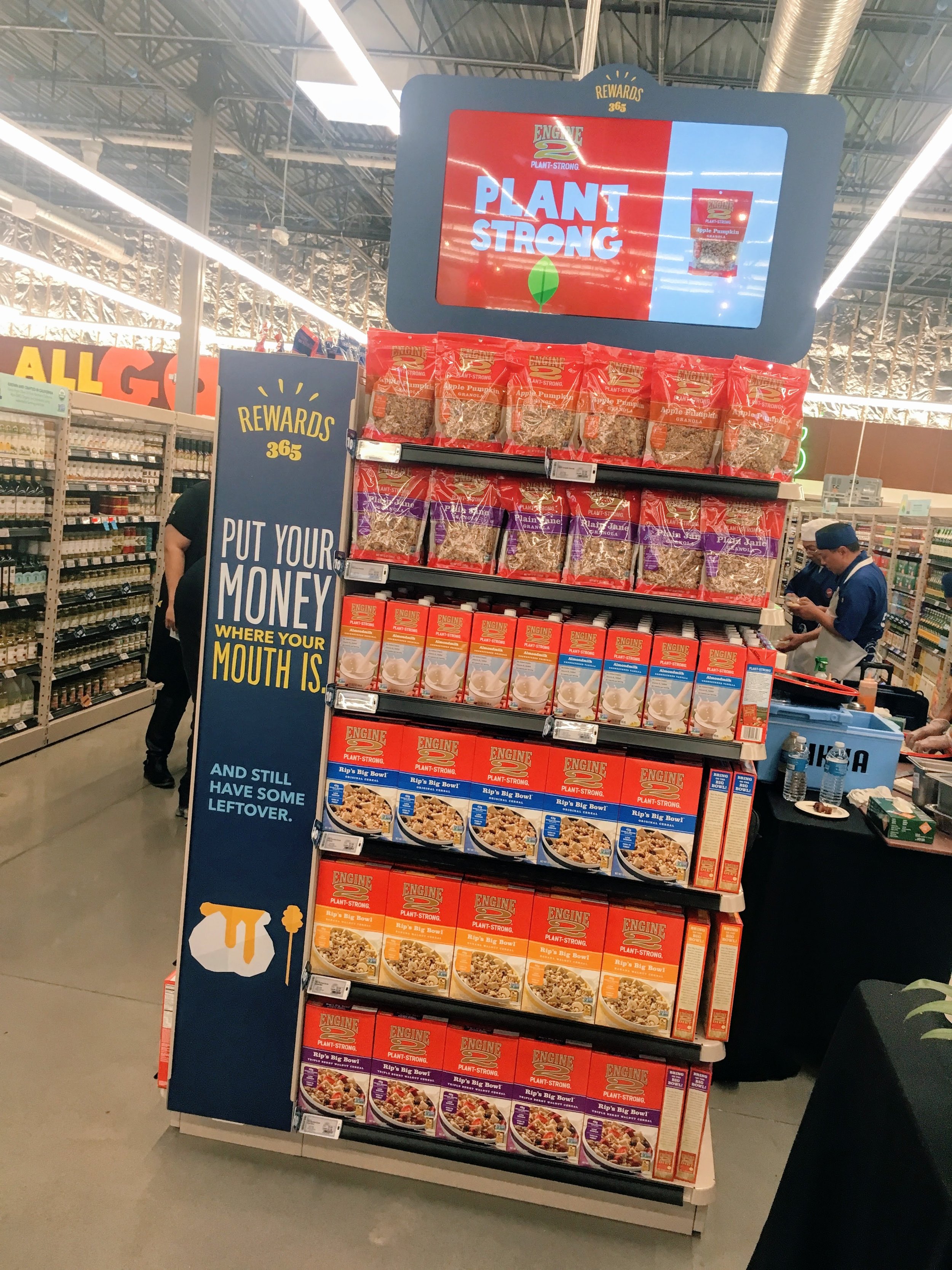
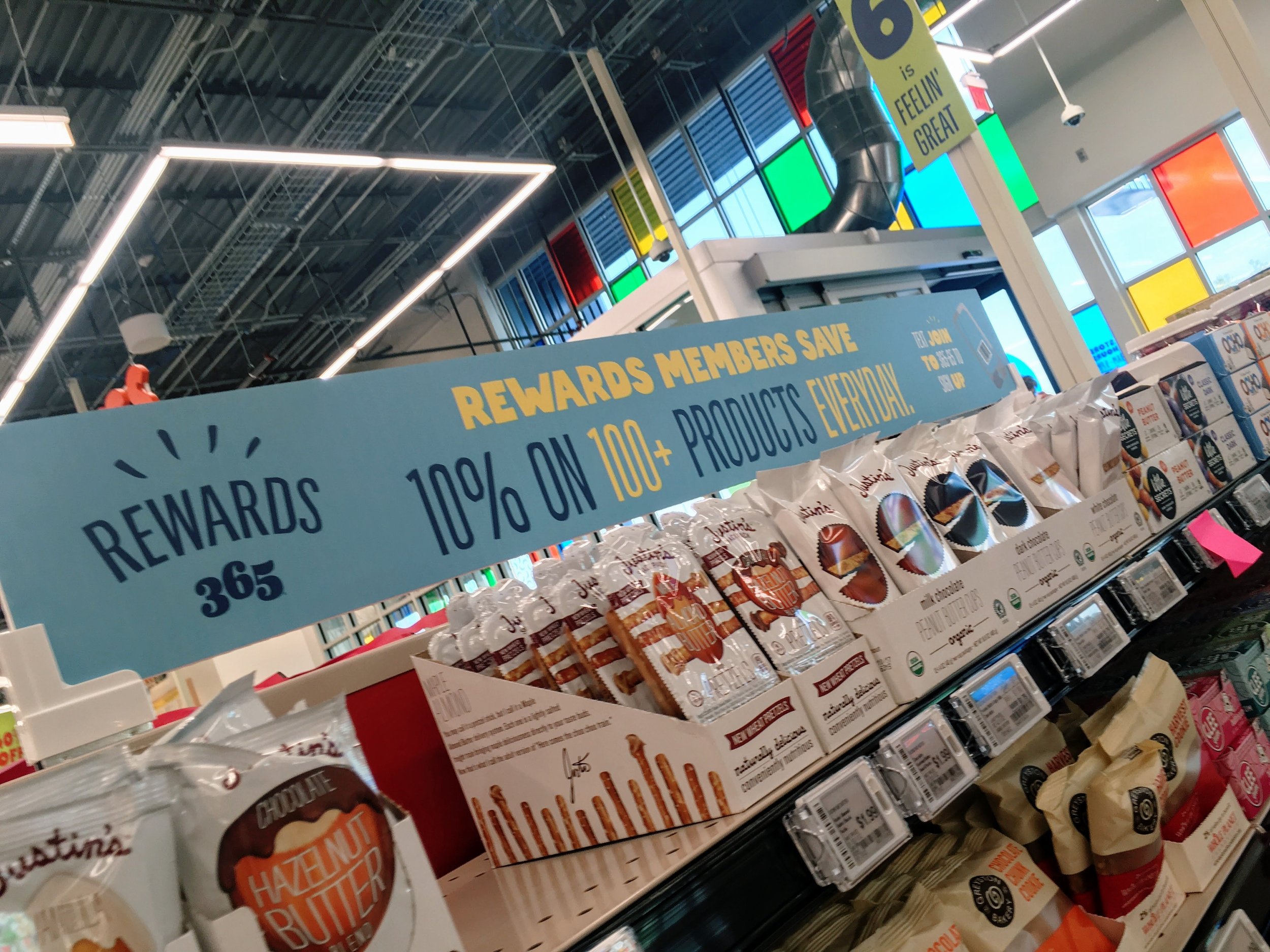
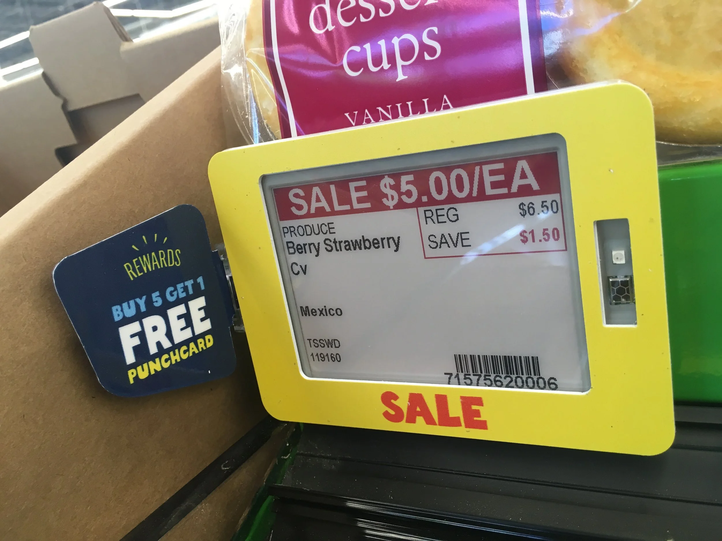
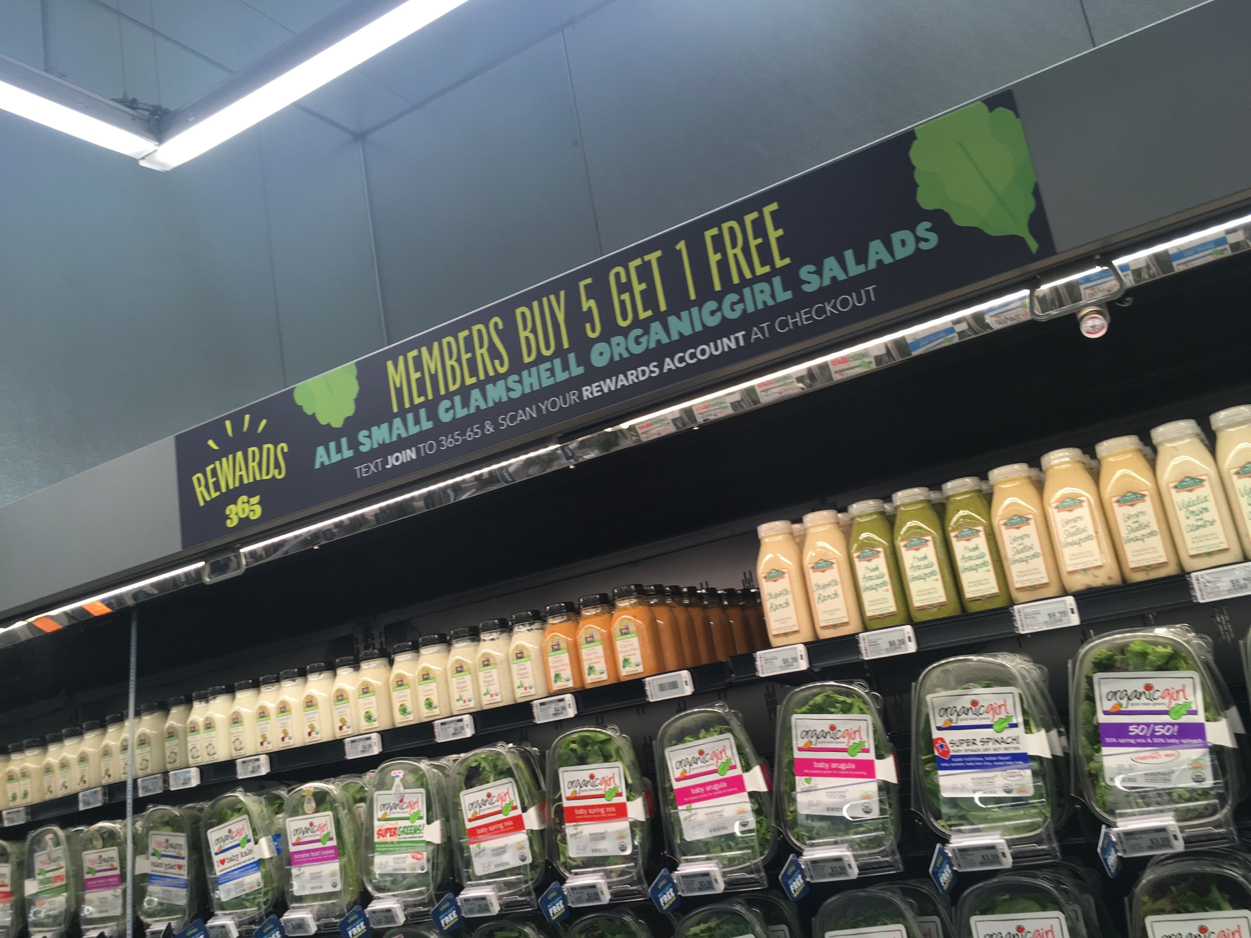
Inside the first few 365 stores, a homegrown signage system was in its infancy. While in theory it was jaunty and fun, the system was overdesigned, chaotically inconsistent, and often a few shades too cute. Wayfinding and labels were unclear. A chummy voice muddied messages big and small. Patches, workarounds, and one-off fixes meant meant disarray.
Worse, the brand felt cheap and immature — a perplexing distant relative of the parent brand. It wasn’t asking the questions consumers were asking: “what is this place — and where can I find the LaCroix?”

First up:
Defining 365’s what and why.
Consumers knew vaguely that this was a Whole Foods,
but it was a mystery why 365 existed. Admitting it was a
discount offering itself felt off-brand for Whole Foods.
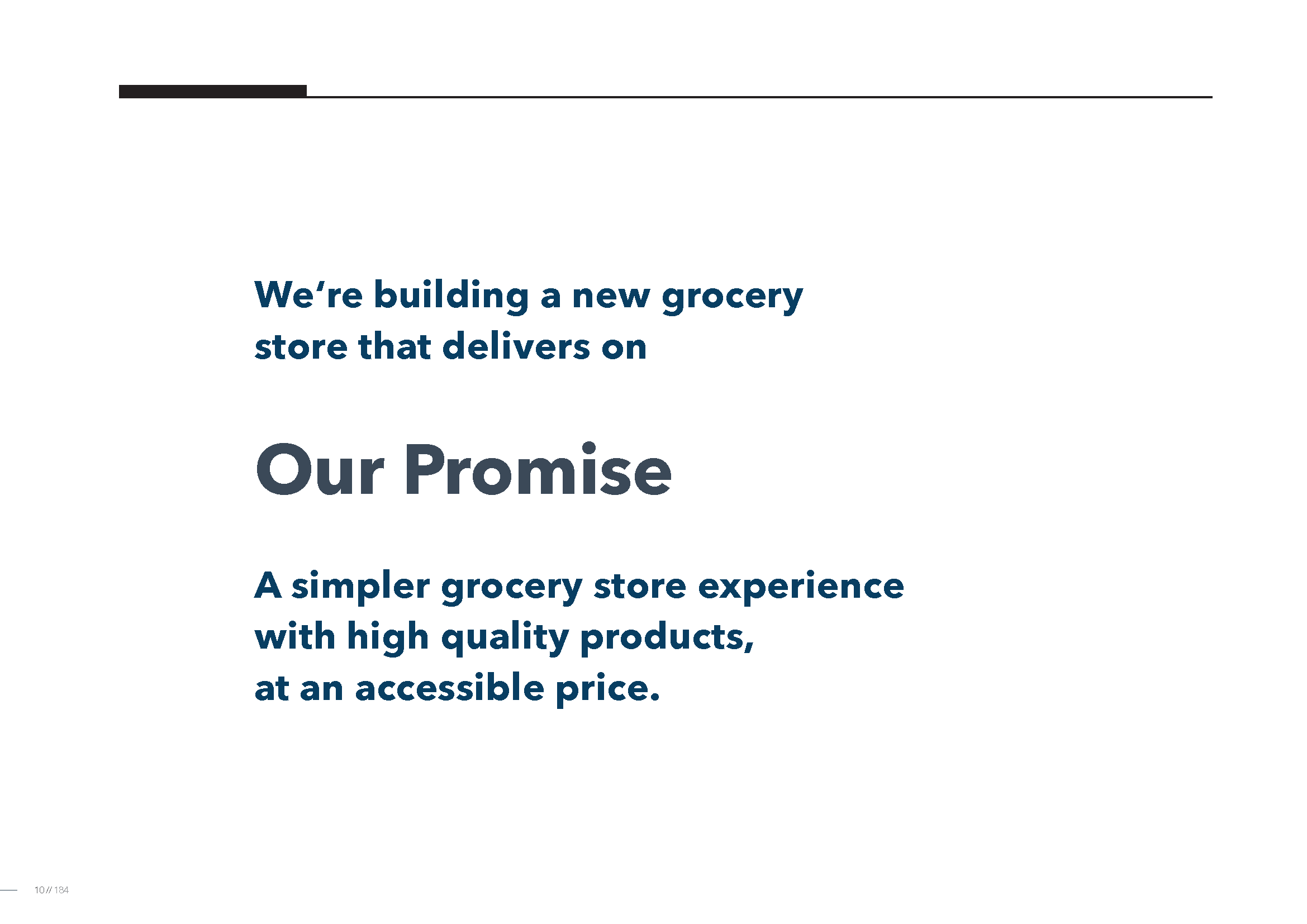
To bridge this conceptual gap, I built this organizing theme
and wrote a line they adopted as a north star:
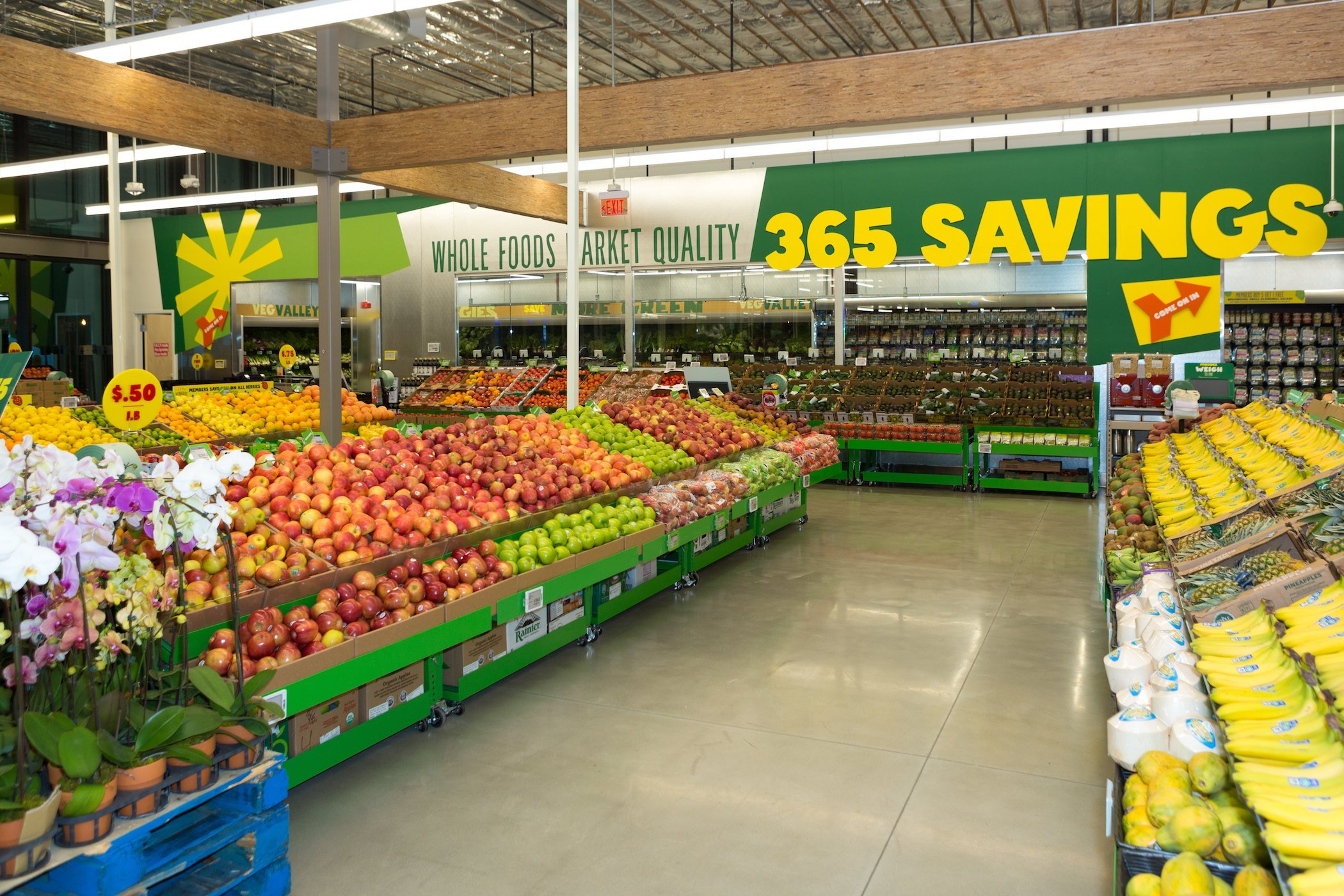
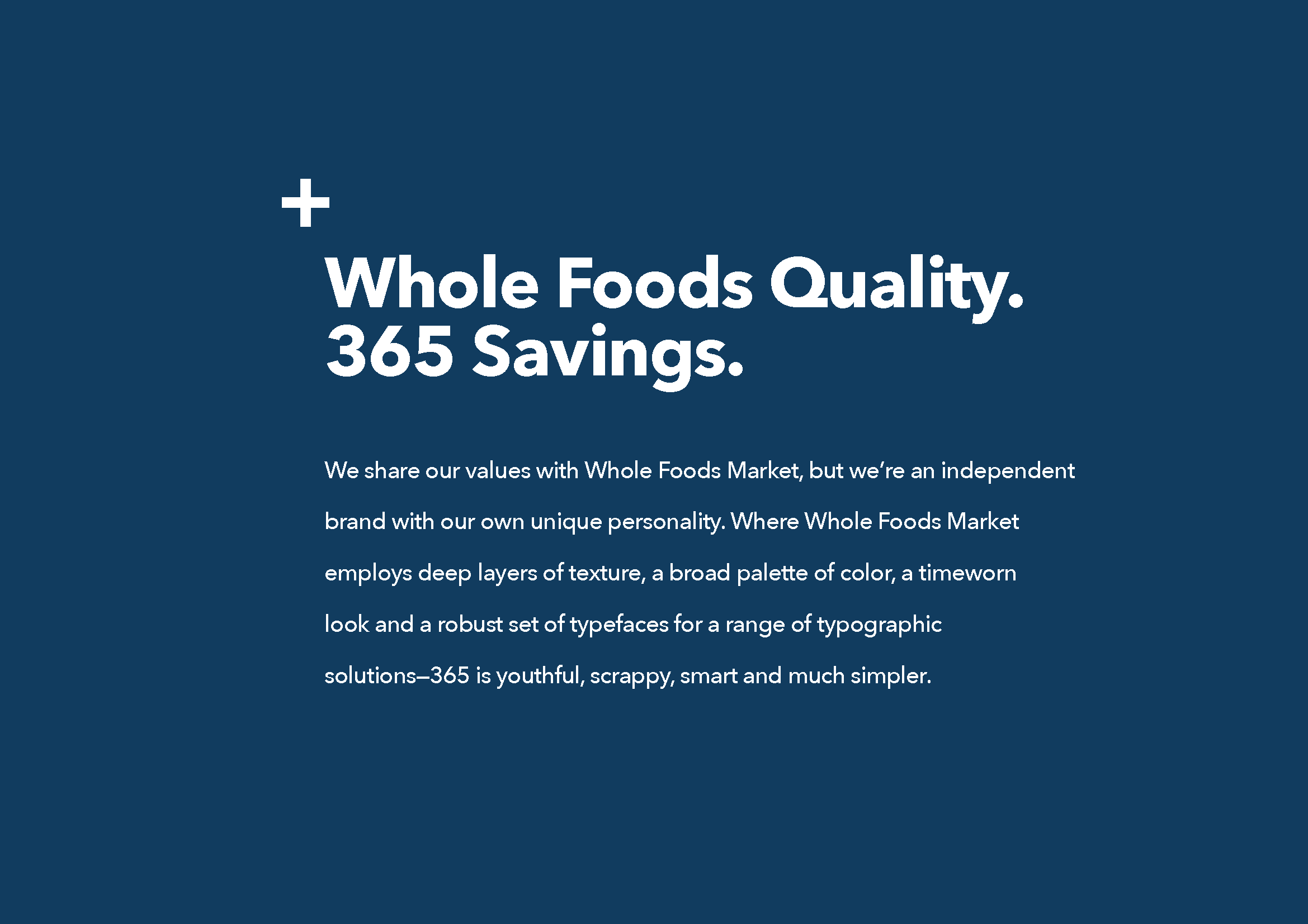
Whole Foods standards. 365 savings.
Simple, effective, and clear. We built a system around it
to help define the brand and its in person experience.


Next up:
Refining and rebuilding the system.
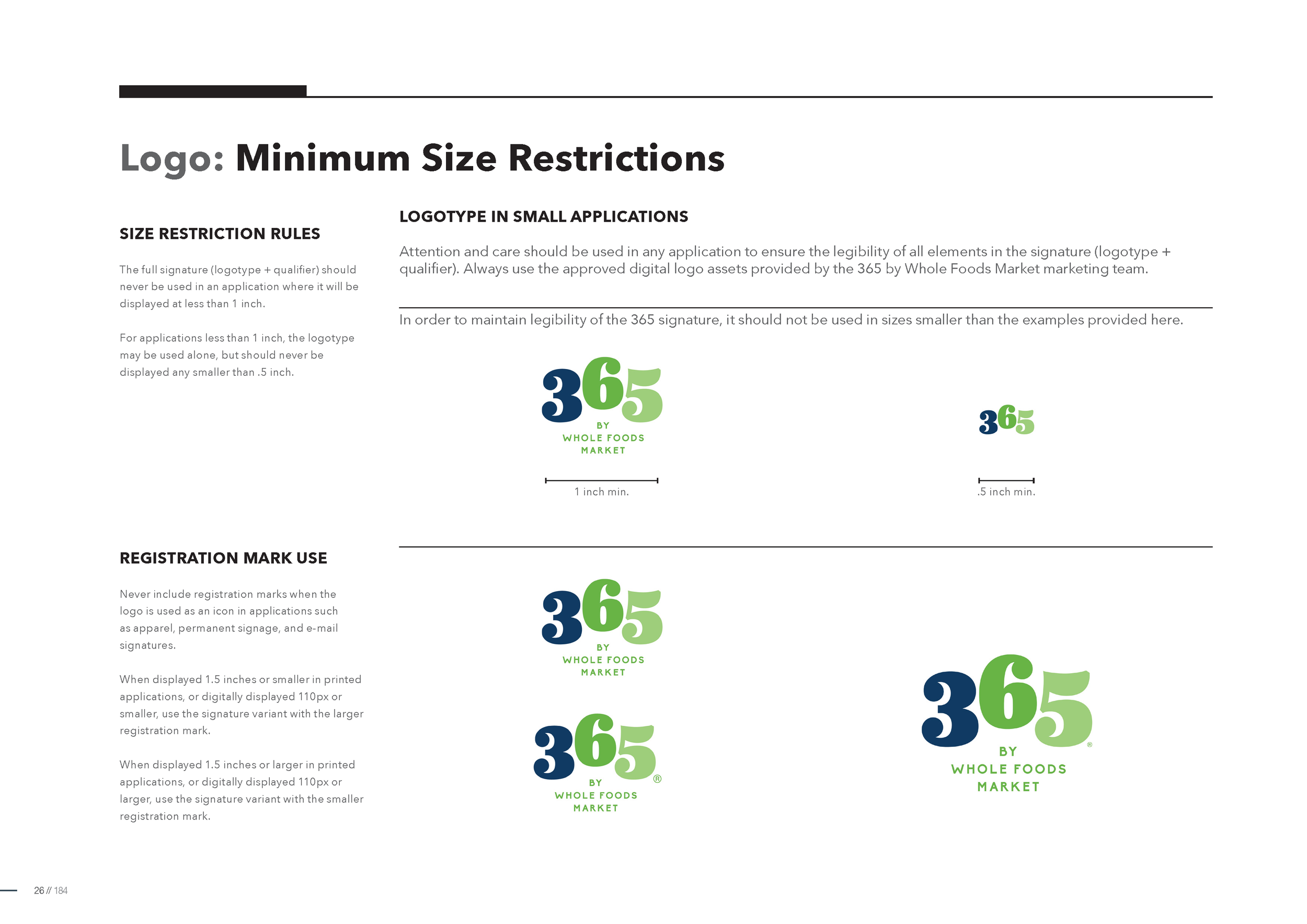
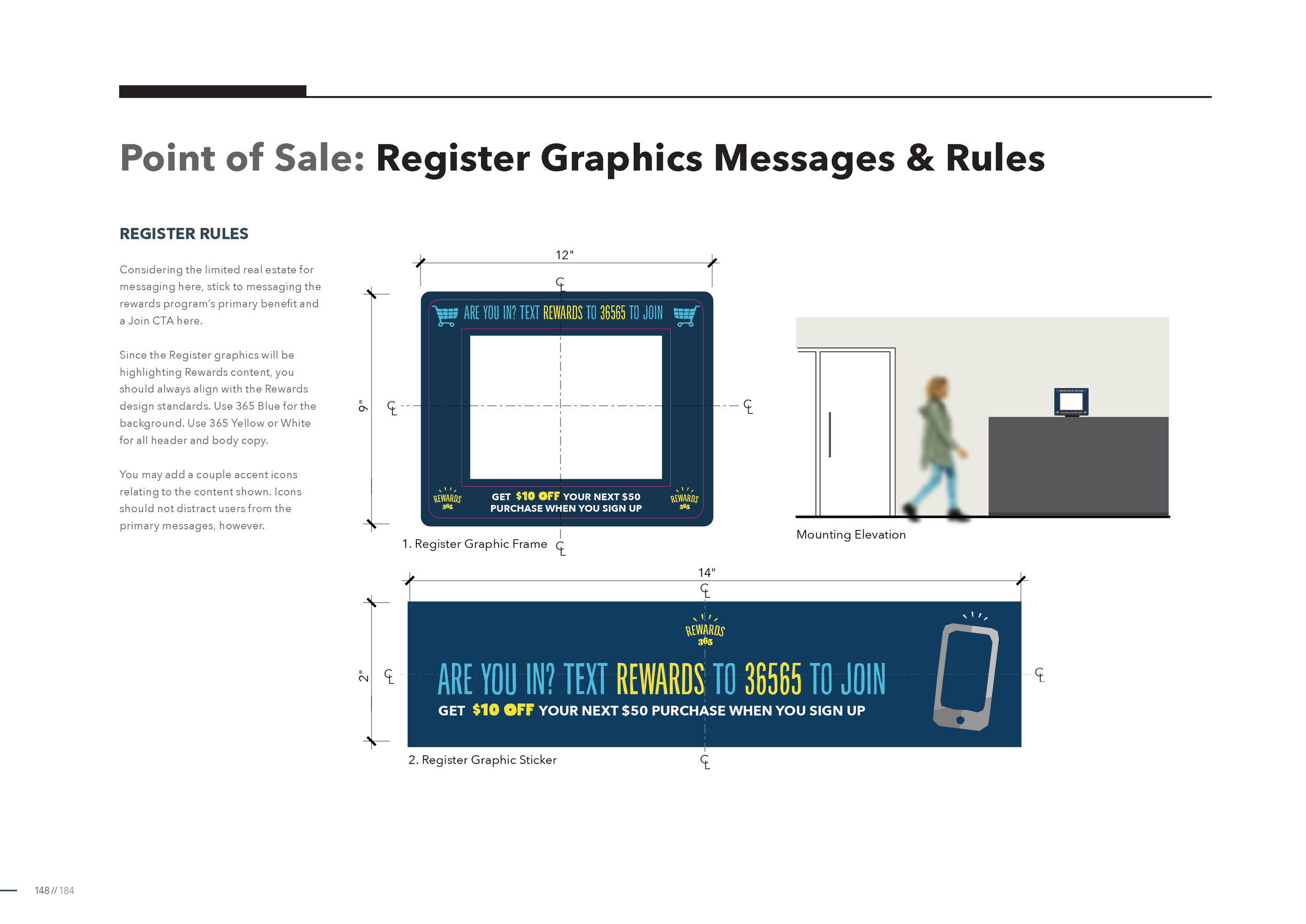
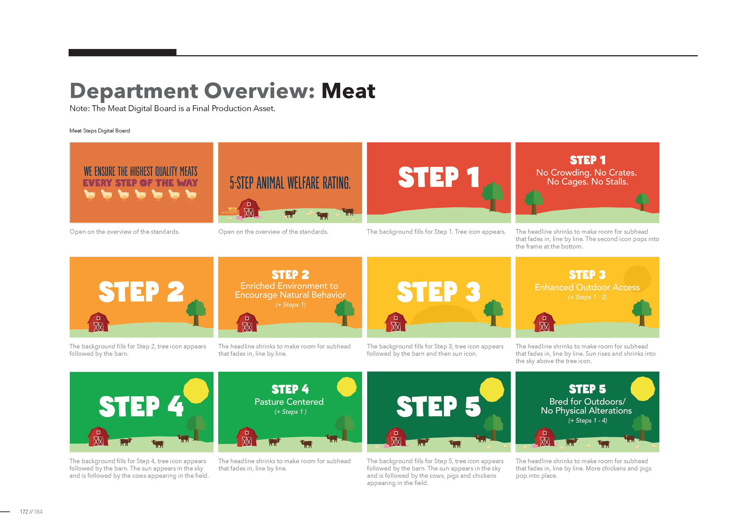
Merging the talents of an experience designer, information architect, content strategist, we built a system that kept the charm, but refined the execution into a system. Taking into account nearly every inch of the store and its systems, we generated a build book and application guide subsequent 365s followed (mostly).


The result:
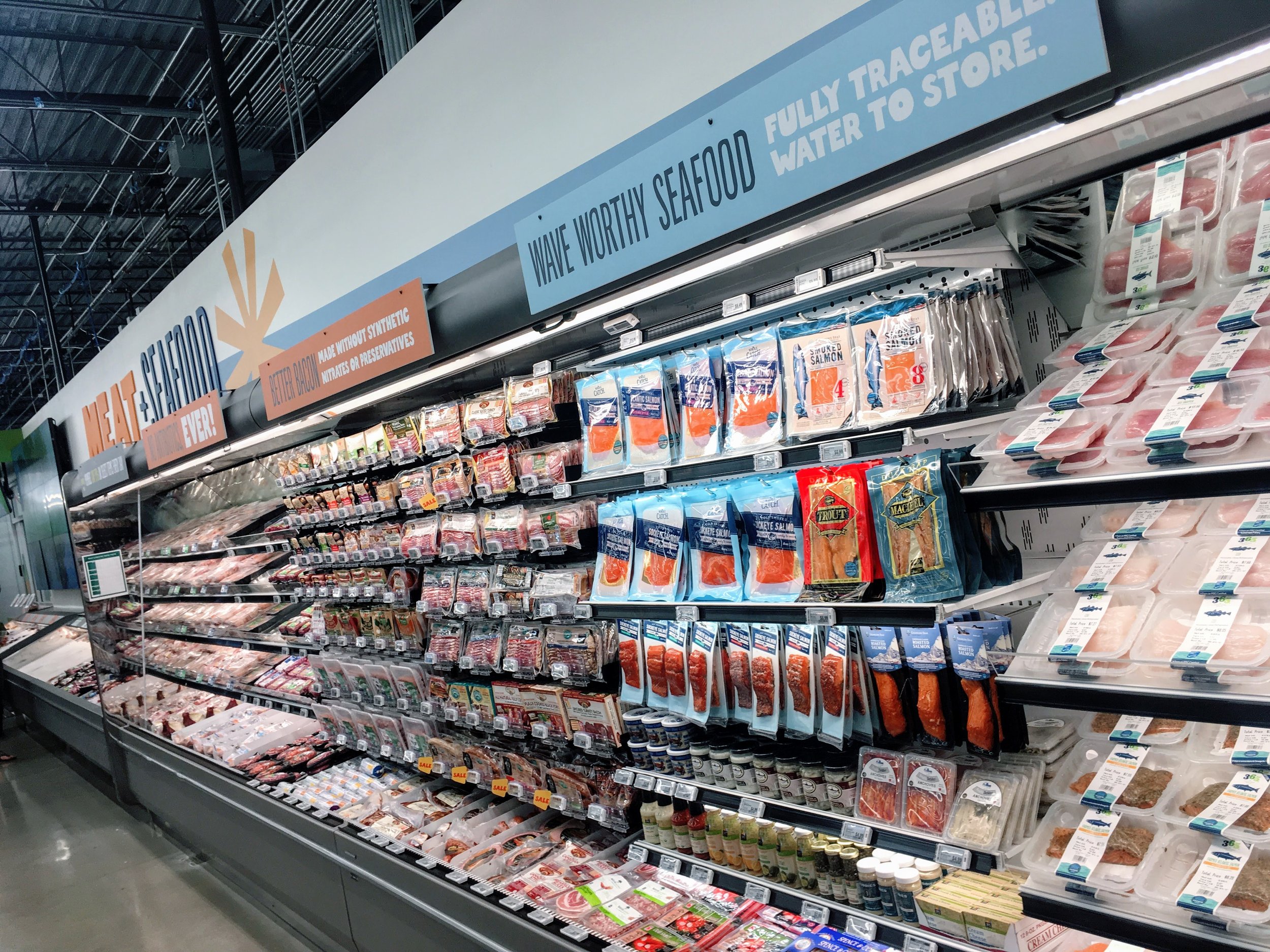
A strong, deeply thought design system, communicating brand, values, and even basic wayfinding.
The system launched in April 2017 at our local Cedar Park, Texas location. It was carried through to a series of subsequent stores (and retrofit into early stores) before Amazon purchased Whole Foods and discontinued 365. But for a vital time, we helped an iconic brand evolve its utility and meaning for consumers.
”Whole Foods quality. 365 savings.” It wasn’t just a sign on the wall, but a newfound ethos for Whole Foods’ short-lived move toward their customers.